A church in Bushey, south west Herts asked us to design and produce their building signs.
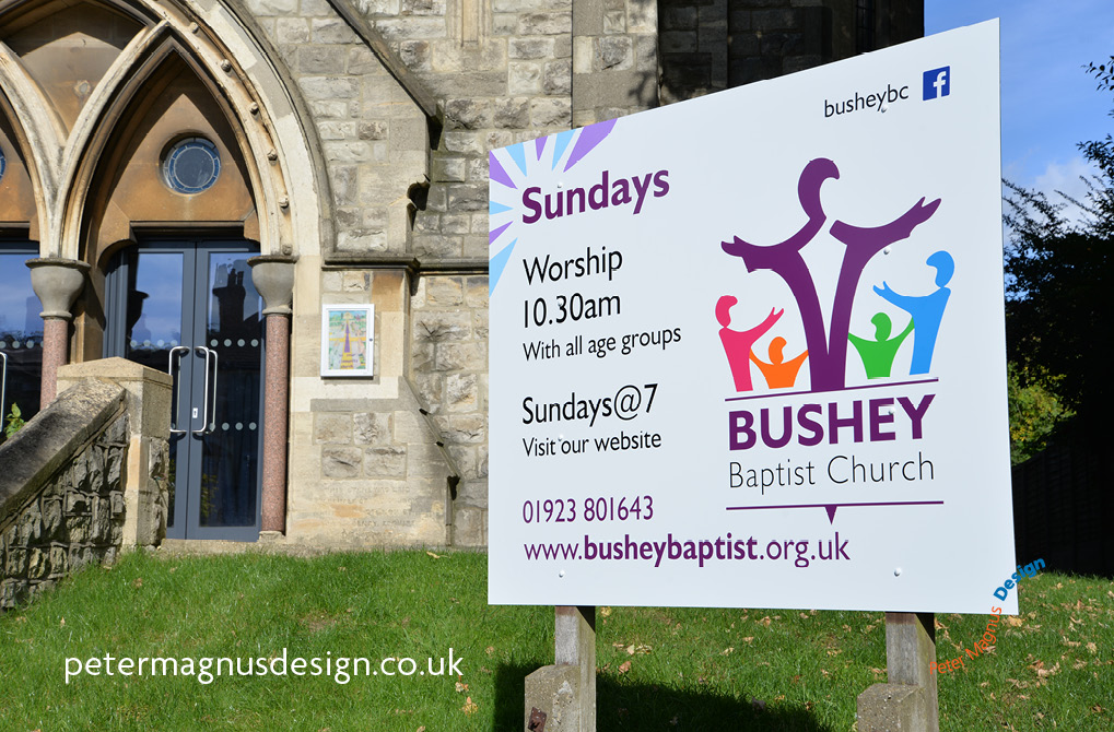
Here’s the story of how we went about this project and what we needed to take into account to do a good job.
Most British people recognise church buildings. Church buildings tend to have a certain shape and even modern style churches normally have a particular architectural style.
We probably don’t need signs to to tell us that a church building is a church, but people who want to attend need to know what its name is, and when the church services happen, maybe they want to know which denomination (a group of church that agree on a set of beliefs, Baptist, Methodist, Church of England are examples) it is too.
Who’s it for?
The first thing we think about when we’re designing anything, are the people who the design is intended to attract or inform – whether it’s a small item like a business card or the subject here – a building sign.
Always ask questions
We ask what information do people want to know most, then design our signs – or other items around those words, and fit everything else that’s required around it, including any branding, colours or logo that the church or denomination that the church may belong to.
Bushey Baptist Church building signs
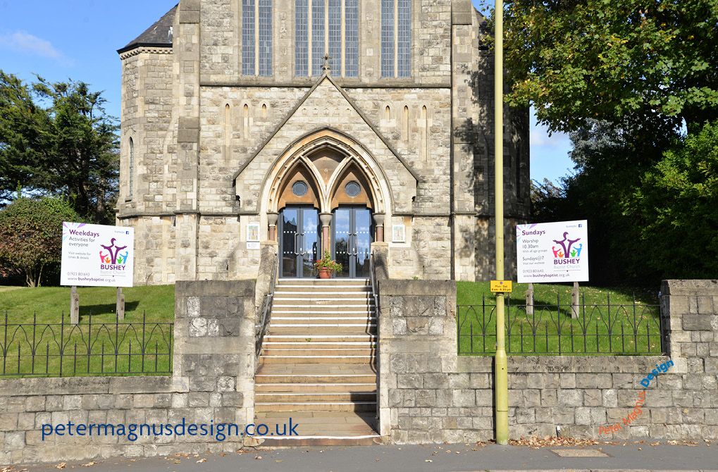
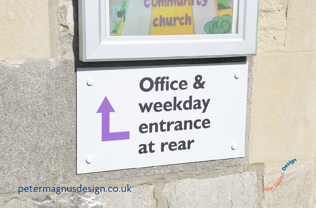
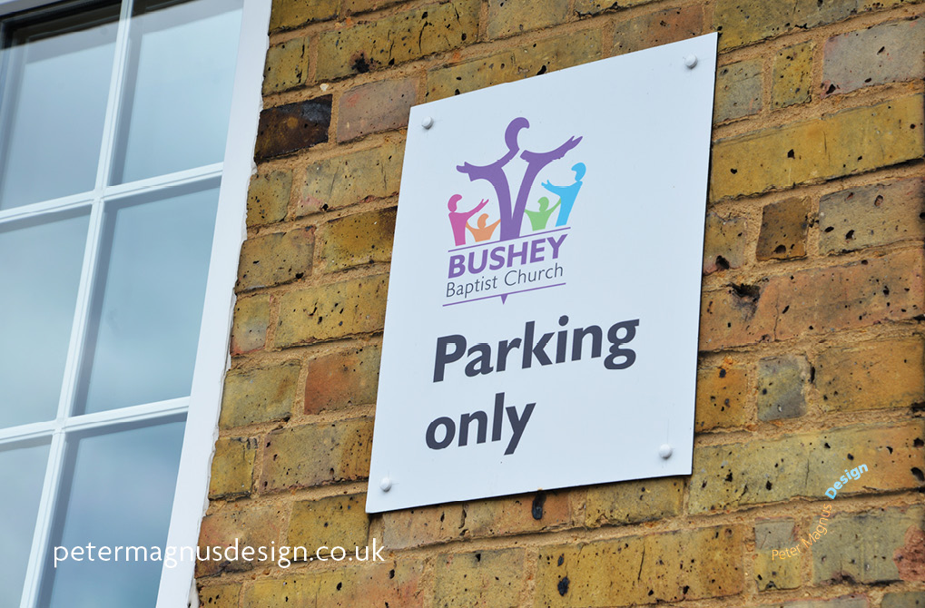
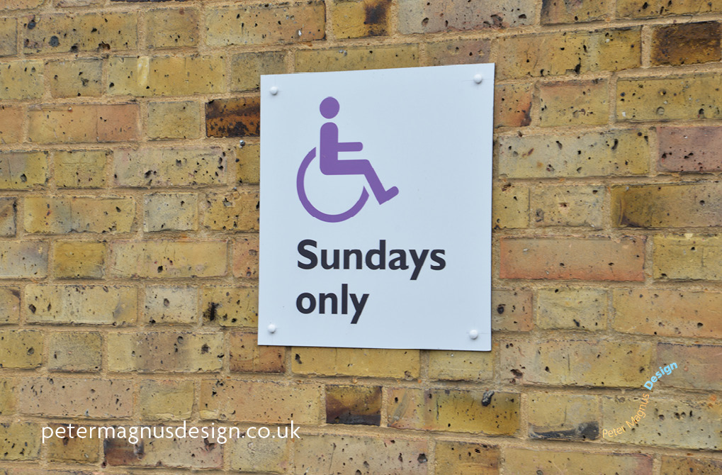
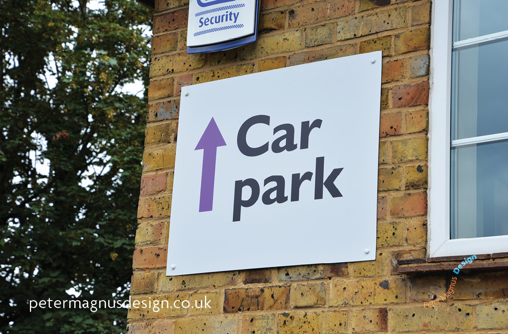
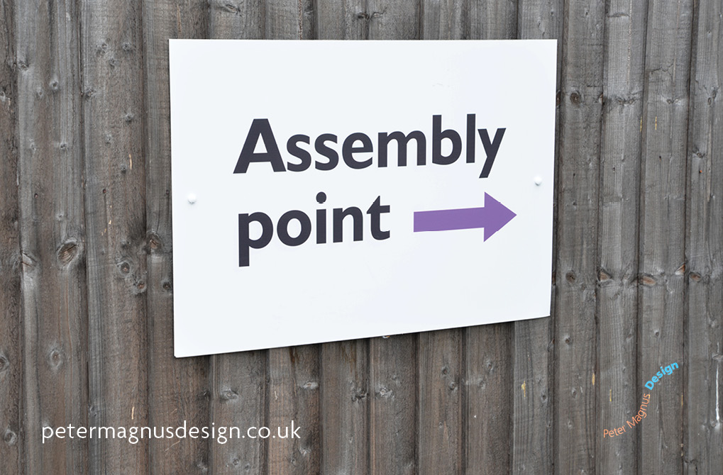
A church in Bushey, (next to Watford, south west Herts) were redeveloping their building. Peter Magnus Design was asked to design and produce the signs for it. There were directional signs, two large existing signs on a slope in front of the church building.
Making things clear
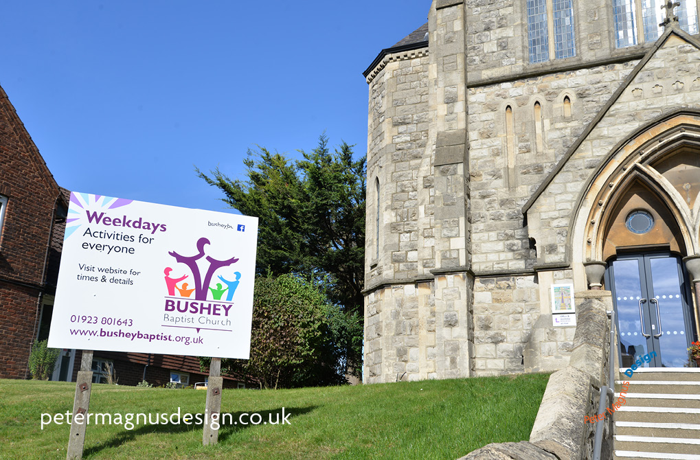
Working with one of the building development team, who had been a property manager for a large company in the England and the US, we came up with the idea of using one of the front signs to to show the Sunday church services and the other to show the main weekday activities.
We wanted to keep the information on the signs as simple as possible as the church and the position of the signs were set back from the road.
Who can see the building signs?
Drivers, passengers, people on buses (Chalk Hill is on quite a few routes to and from Watford) only had a moment to see the signs, so the information had to be simplified as much as possible to have a chance of being read. Pedestrians and people driving down Villiers Road, which is opposite to the church and had a longer time period to see the signs. As the church was set back from the road.
Although motorists normally only have a minuscule amount of time to see the Bushey Baptist Church main signs, there was a busy junction notorious for its congestion at busy times of the day, on their way to and from the likes of Watford to the north and Stanmore, Harrow and Bushey Heath to the south.
Although the chances of seeing were increased by the often slow traffic towards Watford and on Villers Road, waiting to join Chalk Hill, it was felt that our design had to show the most important information in as clear a way as possible.
Bushey Baptist Church on Google Maps
Making the most of all opportunities
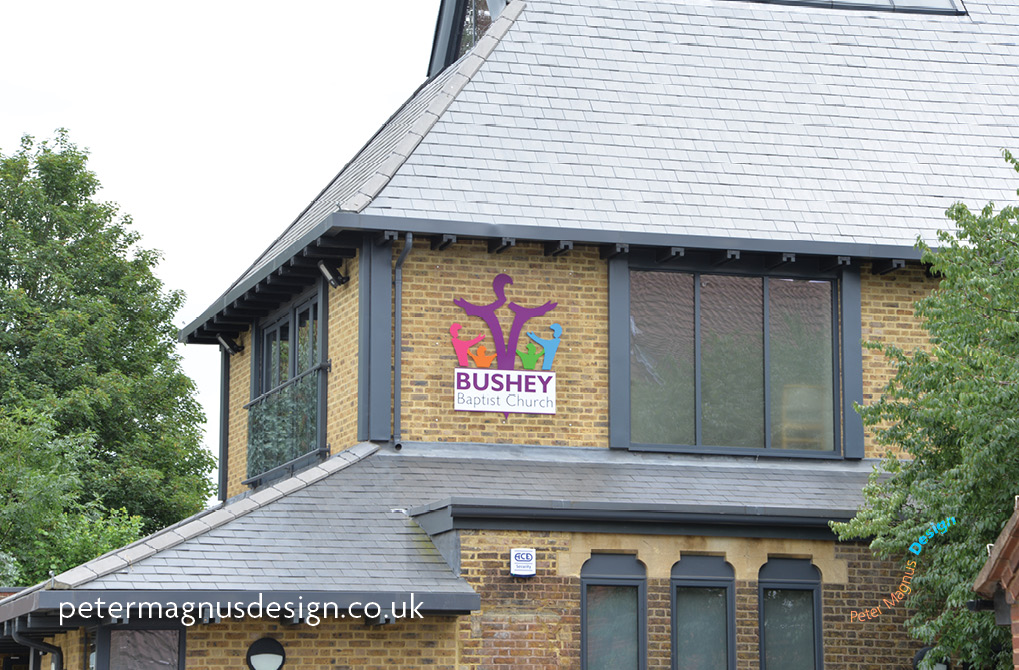
We came up with an idea for another sign to increase the visibility of the church. There was a space on the second storey at the back entrance to the building, on the new extension. We were able to add a large logo mounted on a large clear acrylic panel, which is visible from Aldenham Road, on the way east to the villages of Aldenham and Radlett.
Need design for a large or small sign project?
If you’ve got questions about signs for a building or a vehicle, we’d be keen to do our best to give you some answers, and prices. You can contact John on 01923 350596, 0777 999 1551, or john@petermagnusdesign.co.uk.
